Build an Avatar Reference Board Without Losing the Design
A reference board should explain decisions, not become a pile of images. Use a small, organized collection to communicate proportions, mood and practical constraints. Keep reference material distinct from assets you have permission to include in a finished avatar.
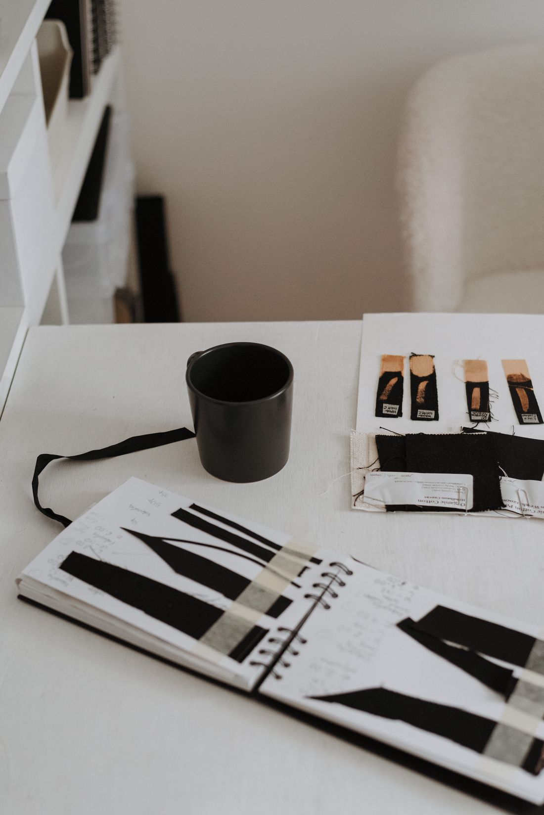
Photo: Anete Lusina · License. Illustrative stock photography.
Give every reference a job
Create separate areas for silhouette, color, surface and movement. Add a short note beside each item explaining what you are observing. A jacket reference might illustrate the width of the shoulders, while a photograph of a ceramic object might suggest a matte surface. This prevents a collaborator from assuming you want to reproduce an entire pictured outfit. Remove any image that repeats an existing observation without adding a decision. A compact board with clear notes is easier to interpret than an impressive collection with contradictory directions.
Build a recognizable silhouette first
Reduce the character to a simple outline at the likely viewing size. Look for a clear relationship between the head, hair and main outfit shape. Choose one feature that can carry recognition when textures are not visible. Avoid depending entirely on tiny jewelry, stitching or logos. If several references imply different body proportions, choose the one appropriate to your destination rather than averaging everything together. Test the outline in a small square crop and a standing frame. A design that remains readable in both is easier to adapt later.
Turn a mood into specific material language
Replace broad labels such as premium or futuristic with observable features: low contrast, smooth surfaces, a narrow reflective trim or a softly structured outer layer. Describe how much of the outfit should look matte and where an accent can catch light. A reference photo captures one lighting condition, so avoid expecting a sampled color to look identical in every environment. Include a neutral background reference and note which appearance depends on illumination. This gives an artist useful instructions without pretending that a photograph is a material specification.
Keep sources and permission status separate
Record the source address and creator for each reference, including whether it is only inspiration or an asset you have licensed for use. Do not place a downloaded texture into the production folder simply because its image appears on the board. If a third-party asset is required, save its actual usage terms with the project. Treat a private board and a publicly distributed lookbook as different outputs with different permission questions. When uncertain, use your own written observations or original sketches instead of redistributing someone else’s picture.
Close the board with decisions
End the board with a short approved-direction panel: one silhouette, a small palette, two or three surface descriptions and a list of things to avoid. Date the approval and keep later options elsewhere. A production reference should not keep changing silently while someone is modeling. If a change becomes necessary, explain which original constraint failed and update the relevant panel. The board is a shared memory of decisions, not a permanent vote among every attractive image collected during research. This makes it useful during troubleshooting as well as at the beginning.
Worked example
For an original night-library character, the board contains a rounded coat silhouette, a pale collar, a muted blue accent and a matte bag surface. One photograph illustrates soft shoulder volume; another shows the desired contrast between dark fabric and a pale edge. Neither image is labeled as a garment to reproduce. A separate panel says no brand marks, no long trailing accessories and no dependence on tiny printed text. The final approval notes that the character must read in a chest-up crop. Production assets have their own permission log, so the inspiration board never becomes an accidental bundle of unlicensed textures.
Your working checklist
Checkmarks stay in this browser when storage is available. They do not submit a form or complete a booking.
Put it into practice
- Collect a small set of references and assign each one a single design purpose. Delete duplicates that do not clarify a decision.
- Sketch the outline at small and full sizes. Choose the features that must stay recognizable when detail disappears.
- Translate mood words into surface, contrast and shape instructions. Distinguish lighting effects from actual design requirements.
- Save an approved panel and a separate asset permission log. Record future changes by date and reason.
Before you finish
- Each reference has a note
- Original silhouette is clear
- Production assets are separate
- Sources are recorded
- Approved direction is dated
Common questions
How many references should I use?
Use as many as are needed to explain distinct decisions, then remove repetition. A short board that resolves choices is more useful than a large board that asks the artist to choose among incompatible designs.
Can I copy a complete outfit from a reference?
A reference is not automatic permission to reproduce or redistribute a design or image. Develop your own direction and check the terms for any components you actually use.
Should I add exact colors?
You can include swatches and approximate values, but review them in the actual application. Lighting, material settings and display differences affect the appearance.